|
|
|
|
title
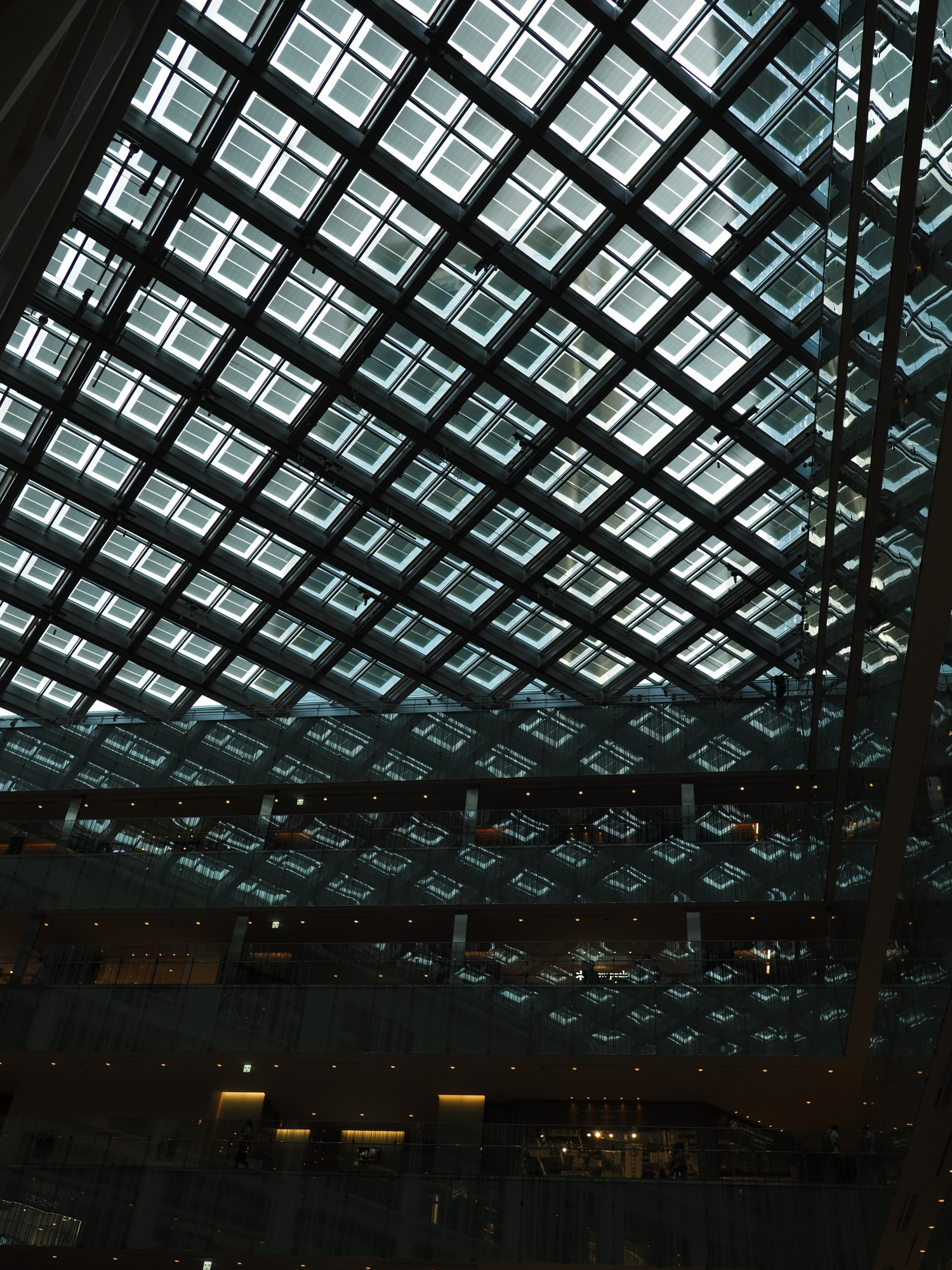
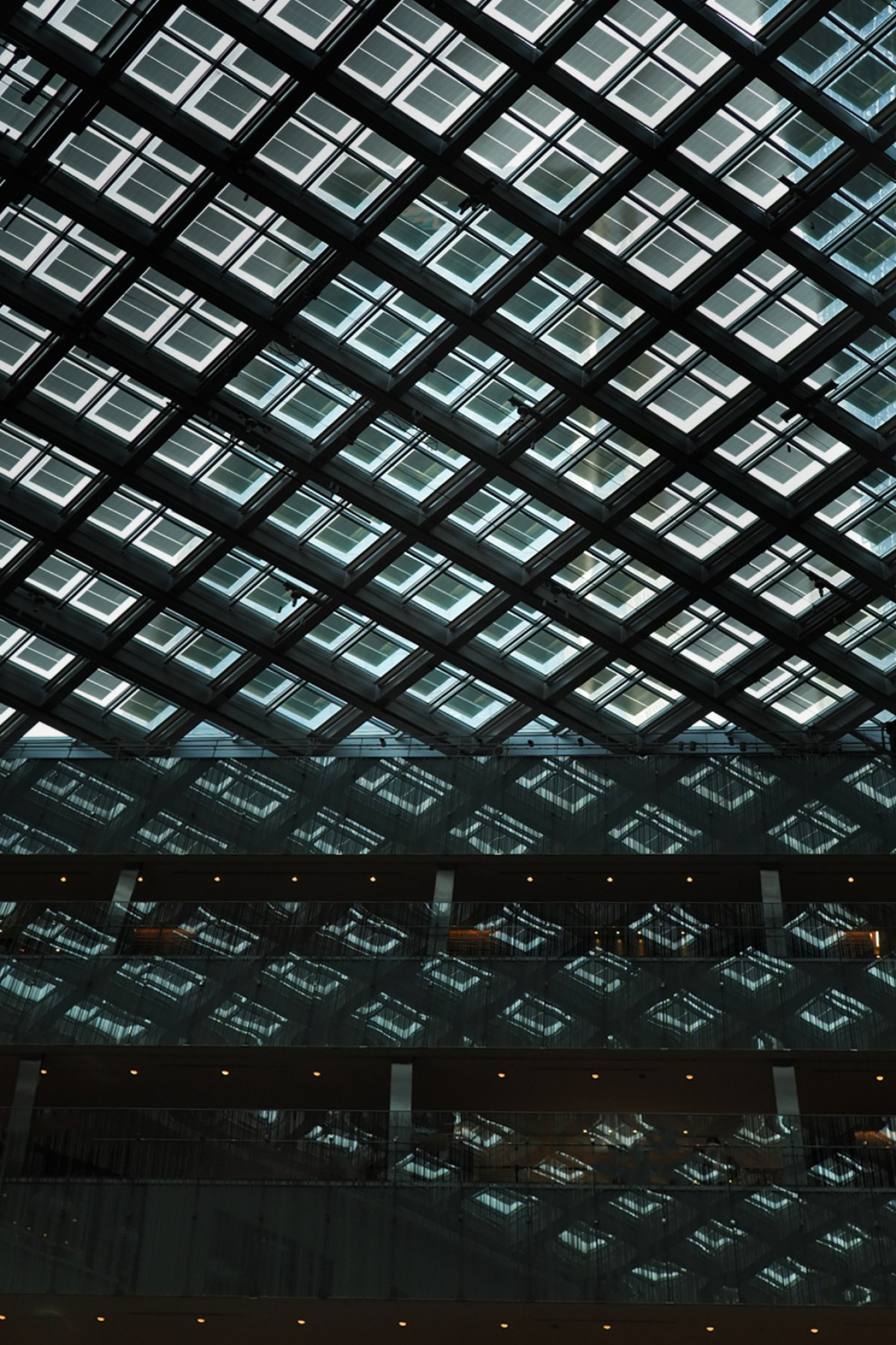
Dialogue of Light and Shadow
Photo Description
I underexposed the image to contrast the light coming through the ceiling window with the shadows in the space.
What I would like to learn
I would like to receive critiques mainly on retouching. I would also like to get advice on composition.
Photo editing software
I use OM Workspace.
Here are some photos before retouching
https://flic.kr/p/2pdicNA
Settings
Micro Four Thirds, f/2.5, 1/400s, iso200, 17mm (34mm)
I’m grateful for your critique
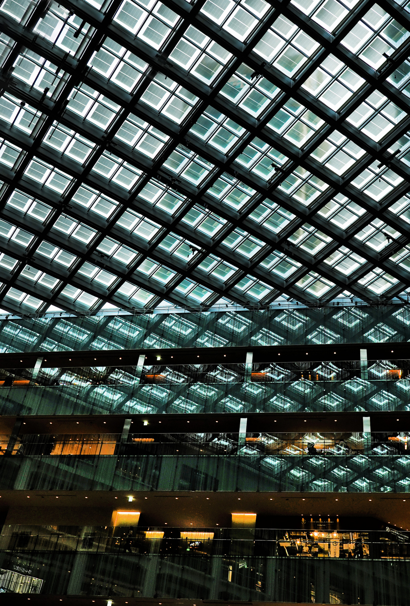
Takuma welcome to " The Real Critique " and thank you for sharing this fine image of yours. - I have had your image back into Photoshop so I could see uip close what looked good and wjat did not. As it stand it's dull looking and a very heavy around the dase area. So on the line on the right side are given your image an off balanced look about it. This is just a few ideas for you to think about. Cop off the right side and top to make the composition for compact. I've done quite a lot of dodge work around the base and sky lights area to add power to your image. I clone a small part ovr the top left corner to help the overall look. - Nok Tool Tonal Contrast to add power. This was all done on the quick more time better the detail...

Hello Takuma
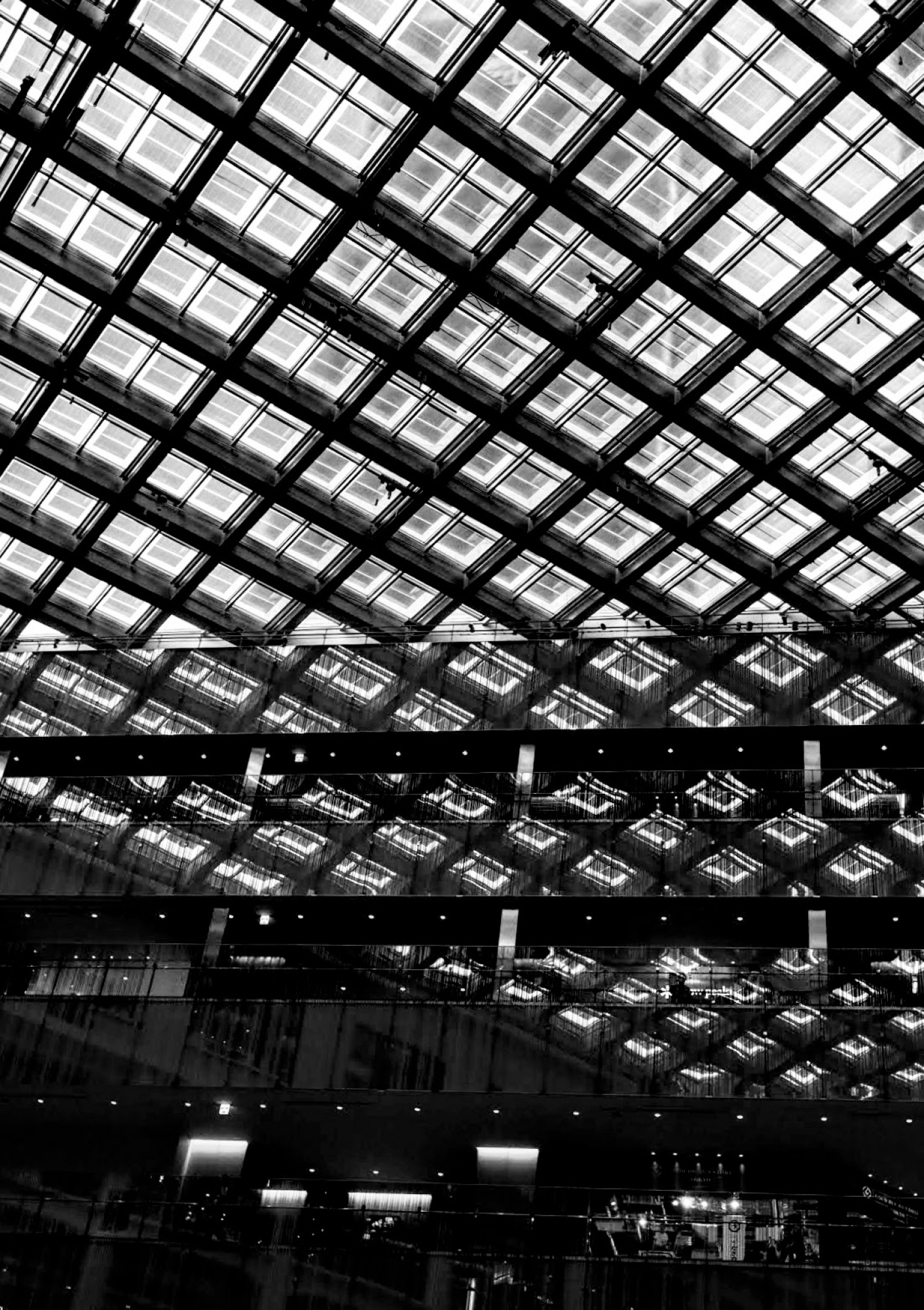
Thank you for sharing this architectural photo with us which I have already commented on in the members' critique area, encouraging you to open up the shadows in the lower frame while maintaining the contrast. Daniel has already given you an excellent edit with more impact. I have cropped your image in a similar way to Daniel to avoid distractions on both sides, but I thought it might also be worth considering black and white for this kind of image with strong geometrical patterns.
Good light, Elizabeth
Takuma,
Arch. and abstract images has to be not complicated. You have too much disturbing details. I played with your image. Not a good one but only to see the direction I mean. Theo L.
A sorry something went wrong he is placed two times.
Daniel, Elizabeth, Theo
Thank you for your response. It was very helpful to understand the improvements. I will try to retouch again.
