|
|
|
|
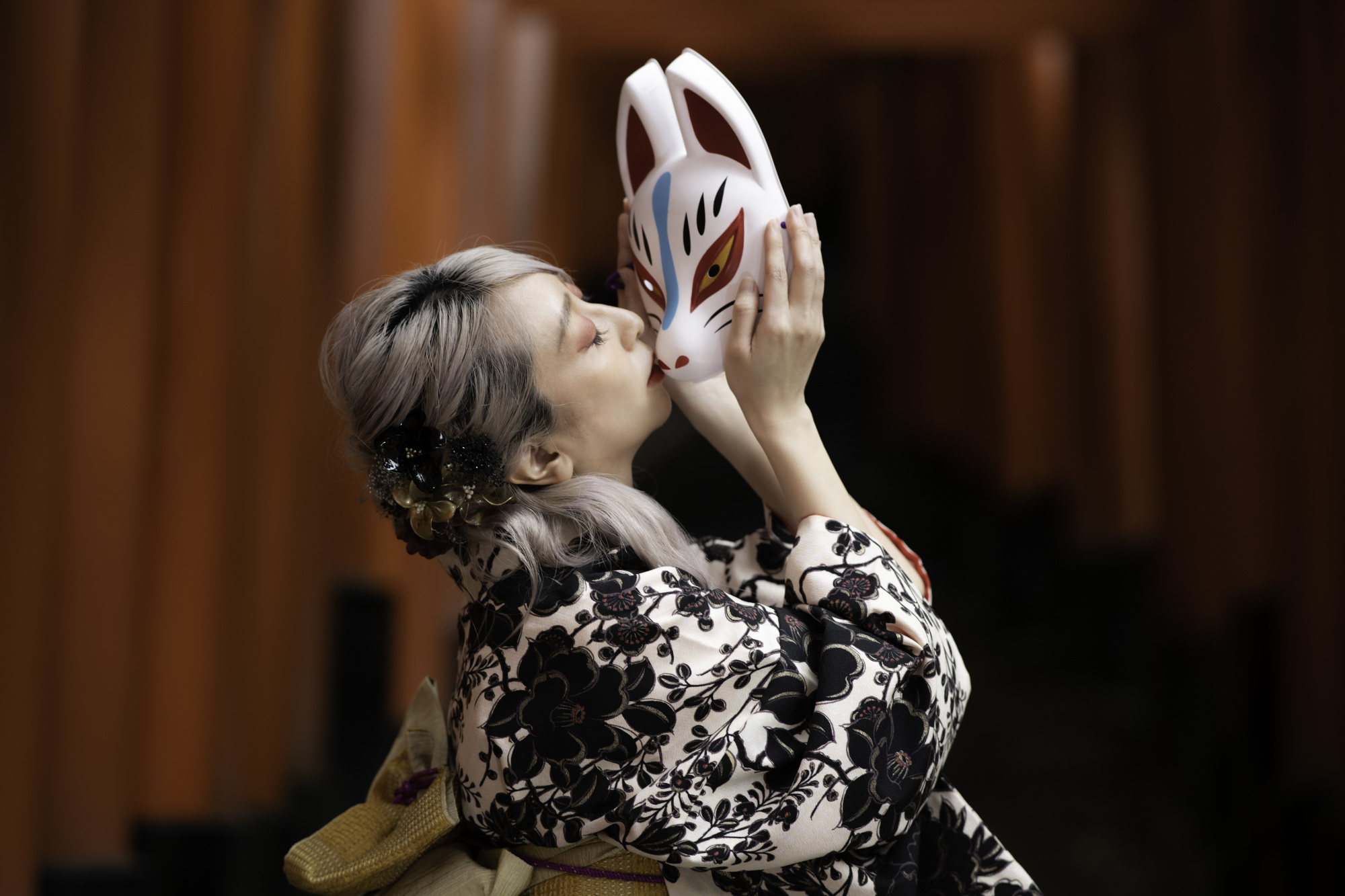
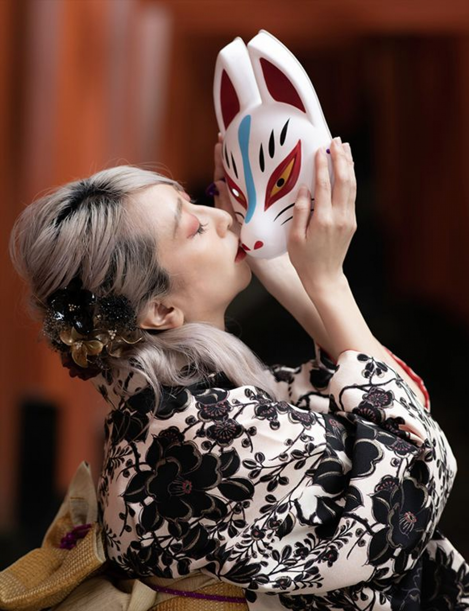
I took the picture with the image of wearing a mask as if it were an unforgettable person and kissing it.
The model is also interested in this photograph and plans to display it as one of three pieces at the largest portrait exhibition in Japan.
Although we received highly praised comments from some people, it was not published.
How can I restructure this photo to make it more attractive?
MSYK,
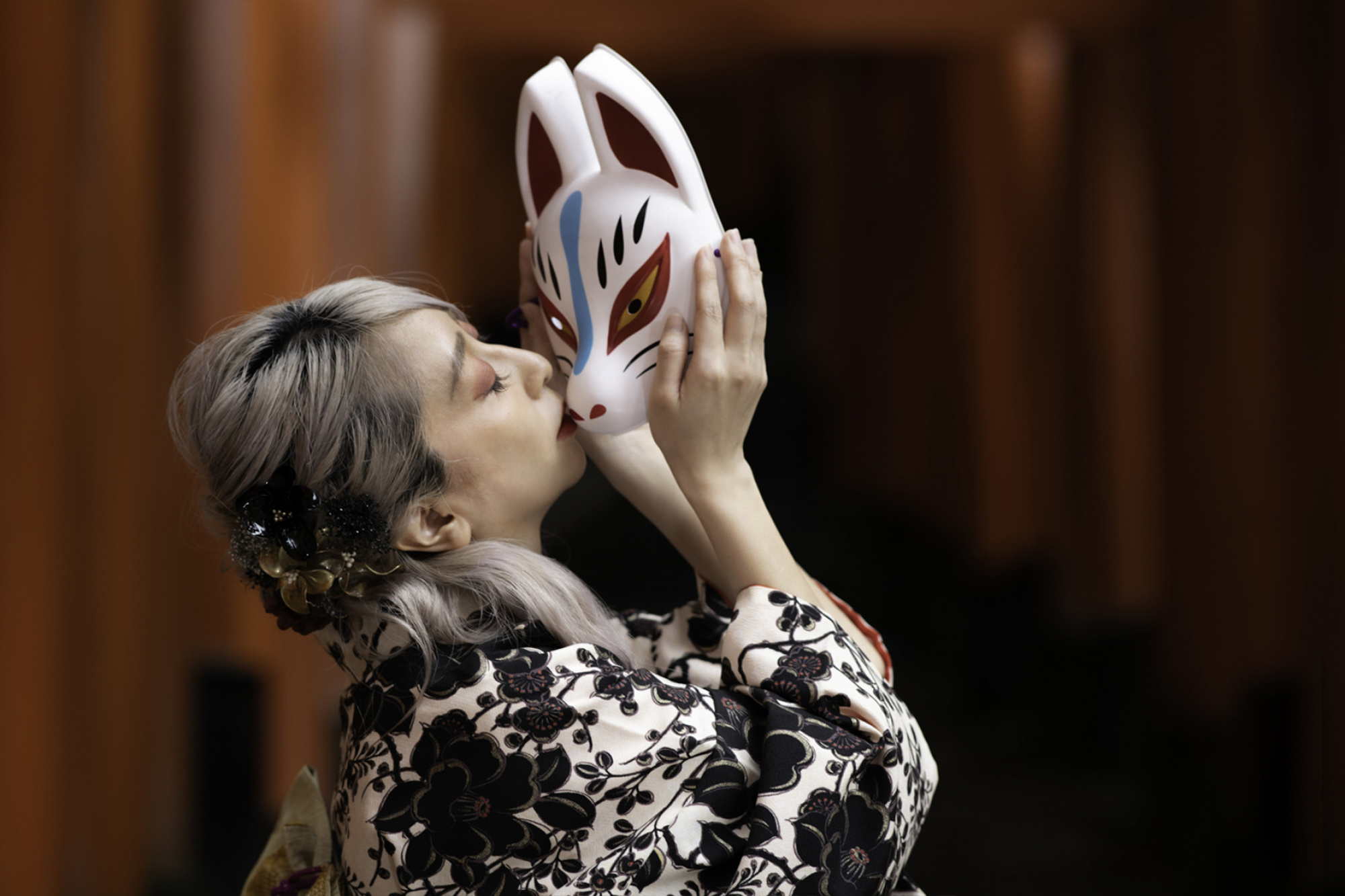
I think you have to give your presentation more attention. I think my solution will not be P but it looks better. What I did: I straightend the certains. I removed disturbing elements below and I brought the model a little bit out of the centre. And at last I played a little bit with the light on her face. See below if you like it. Theo-senior critic.
PS. I was on your site and you have wonderful images, so I am suprised the way you presented this one. I hope I don't disappoint you, see my remark as a compliment!
Thanks for the advice. The yellow band, which I thought was necessary for me as a Japanese person, seems to be an extra color. I felt that there was a lot of margin on the left and right, so I will use it as a reference for trimming.

Hello, MSYK
Thanks for posting your image in our forum. I totally agree with my friend Theo Luycx. I think the composition is to blame here. The horizontal frame and the model with the mask do not look much interesting. I would have preferred a vertical image. Below is a screenshot that I just cropped. That and the cleaning of distracting elements would make a difference for sure. And if you would upload it again, do not forget to write what the story is into the photo description. I think when you tell the viewer your intentions the evaluation changes....Have good light....
Cicek Kiral SC
Thank you for your feedback. I also took a picture vertically, so I would like to post that in the future. I'll also write a story.
