|
|
|
|
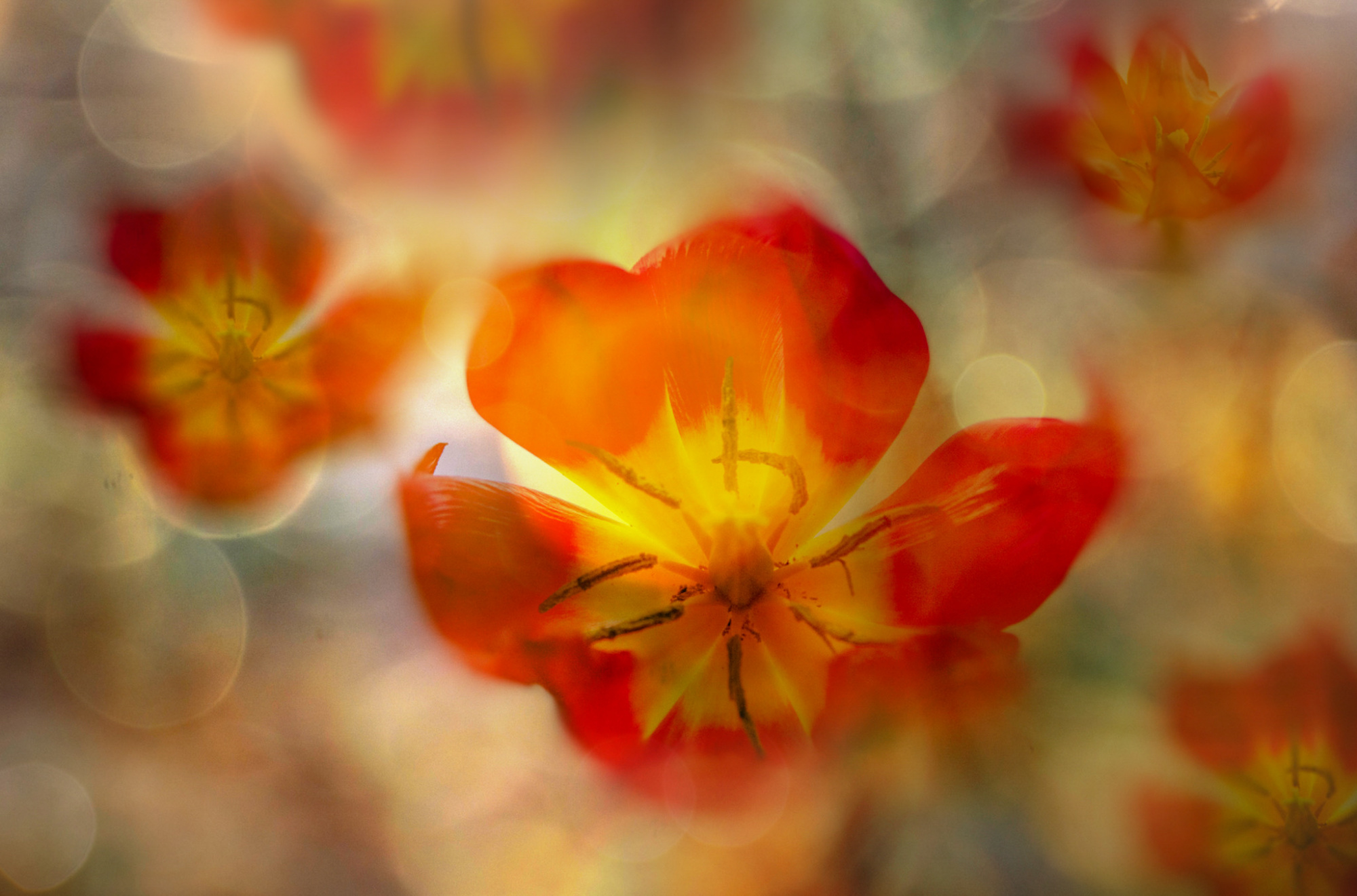
Hello everybody, it is the first time I submit a photo here. The image Red tulips is about the coming of spring with the emblematic spring flowers - tulips. I tried something more unusual, pattern-like, even though the flowers are totally wrapped up in a golden haze and light so perhaps not really a pattern. I think it is hard to explain, it is about mood, more specifically the emotion we experience at the soft touch of spring which we all feel in ways so hard to express in words. I tried something poetic, flowers being like repetition of a word - spring, spring, spring. I started with one single red tulip which I modified differently using "iris blur" in Photoshop. I mixed in a few extra layers of light and colour. (I have a folder of "overlays" to add to my photos.) I would really appreciate comments and I thank in advance to anyone who contributes. And of course: is it worth submitting it for curation or just move on.
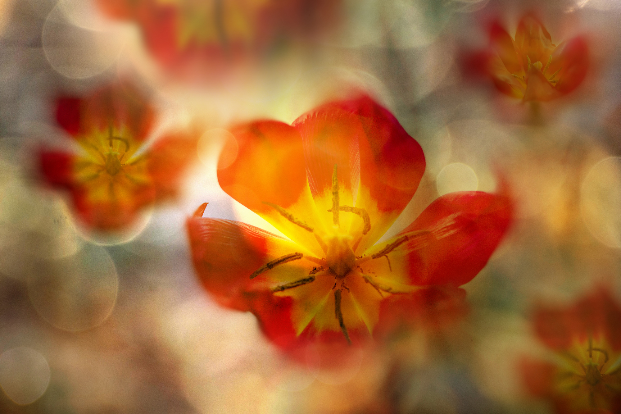

Hello everybody, it is the first time I submit a photo here. The image Red tulips is about the coming of spring with the emblematic spring flowers - tulips. I tried something more unusual, pattern-like, even though the flowers are totally wrapped up in a golden haze and light so perhaps not really a pattern. I think it is hard to explain, it is about mood, more specifically the emotion we experience at the soft touch of spring which we all feel in ways so hard to express in words. I tried something poetic, flowers being like repetition of a word - spring, spring, spring. I started with one single red tulip which I modified differently using "iris blur" in Photoshop. I mixed in a few extra layers of light and colour. (I have a folder of "overlays" to add to my photos.) I would really appreciate comments and I thank in advance to anyone who contributes. And of course: is it worth submitting it for curation or just move on.
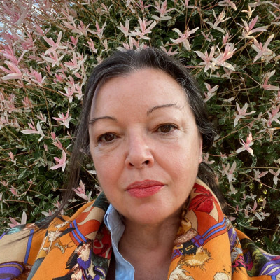
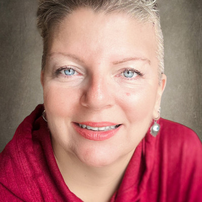
Hello Ludmila Shumilova and welcome to the Critique forum.
Thank you for giving us an opportunity to provide some feedback on your fine floral image. I like what you did with the background. Very nice effect.
My first impression is that I really like this image. It is the kind of floral work that I like. But then when I look at it a little more I realized that it is too dark in my opiniong.
So I imported your photo in PSE 21 and did the following: First, i made it briter over all but had to tone it down a little where the yellow parts of the top petals in the flower in the centre were. Brightening there couldn't be as strong. Then, I cloned the space between two petals of that same flower (left side, like a triangle) because that was also too dark. I used the texture from below the tulip. Then I made the central flower warmer and increase the saturation a little. I then applied some dehazing on the whole picture. Some of the circles are bothering me (distracting me) so I cloned out the one in the tulip left top petal and where that circle touches the tulip in the background. You might want to soften the other circles.
I did not do any Denoising. I wasn't sure if you wanted it noisy (grainy) or not.
So those are a few suggestions for you. You are free to apply them or not. It is your picture!
And yes, I think it would be worth submitting your photo with a little extra processing.
Good luck !
Lucie s.c.

Ludmila welcome to critique - May I jump right in. - I have spent some time just loooking and yes enjoying your fine image. - Love the colour scheme and balance. May I first give you my take on your image. I love the lead flower but feel is needs to be sharper and more prominent - I've added Nik Tools Tonal Contrast to the lead flower only to add texture. Did some dodge and burn to help balance. - Last sharpened using Topaz AI - Will it stand a chance in selection I would give it 58% chance thank you for sharing.

Hello, Ludmilla
Welcome to our forum and thank you for submitting this beautiful image. I think you did a great job and you should definitely submit your image to curation. I'm sure you will get great results. However, I have a few suggestions. First, 1 advise you to reduce the highlights and the whites a few degrees. There are too bright places at certain edges. Then I think adding a little dehase would soften the overall image. The color and the boles are great. I wish you good light... Cicek Kiral Senior critic...
.
Dear Lucie, dear Daniel and dear Cicek, I am overwhelmed by your amazing observations and the effort you put into working on the image, thank you so much! I am so grateful! Your comments are very to the point and I agree fully. This is a wonderful experience for me!
thank you so much for your keen eye and subtle remarks which will help me improve the image.
Ludmila Shumilova
Hello Ludmilla,
Thank you for trying out critique, I'm glad you enjoyed the experienence. When I see a photo first time, I try to capture my first two seconds of thoughts. There isn't a second chance to do this, so this became a habbit. My spouse and I shoot weddings, sometimes together, mostly not. When ever she shows me a photo, I share my first thoughts, which is not always appreciated, haha!
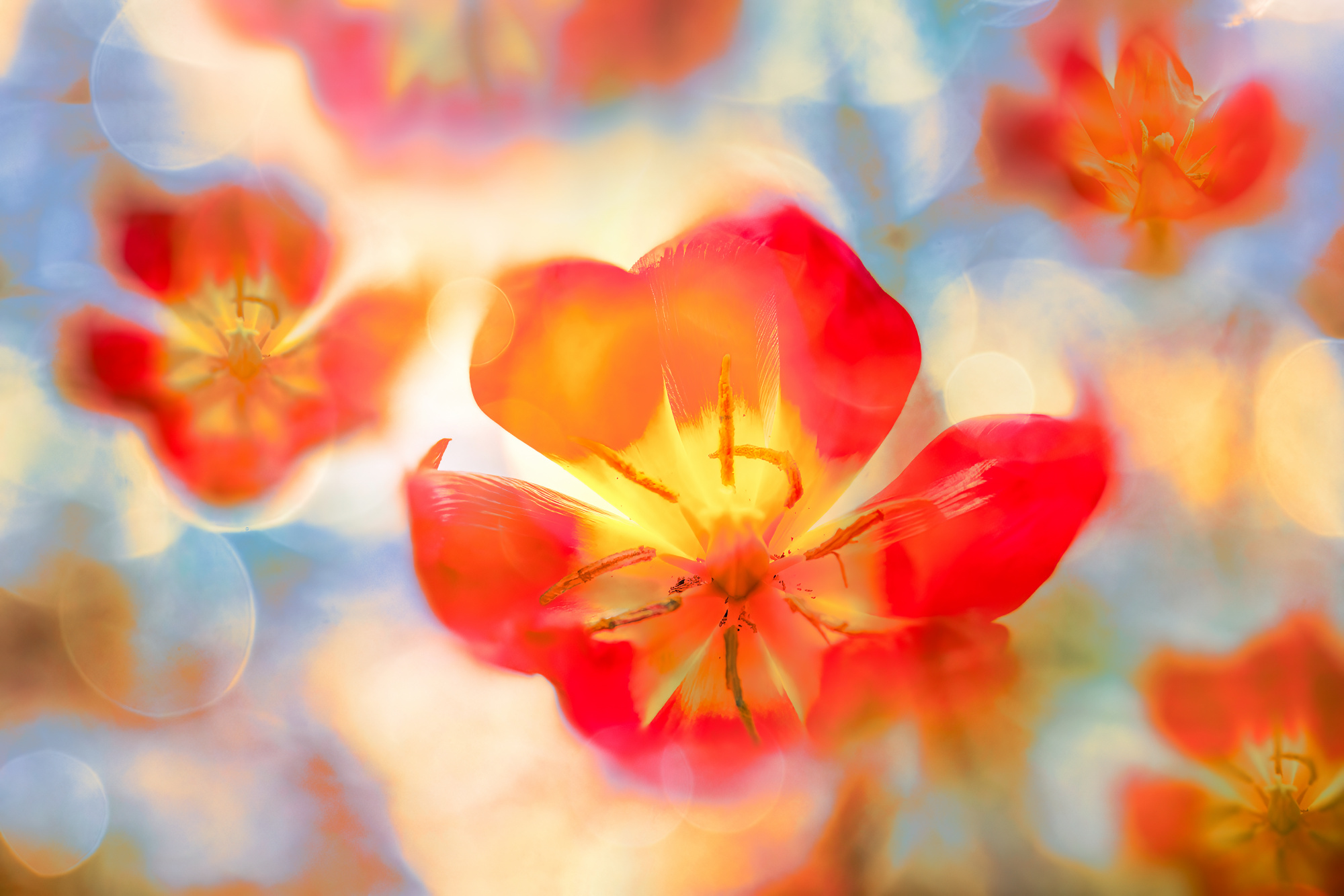
In your case, my thoughts were: delicate - sunny- too dark for the flares - too much tone in tone. Since roughly a couple of months, Adobe introduced another way of selection. It's kind of a light-weight luminance mask. This way I added a second color. Usually red and blue work well together, not really complimentary, but close to.
Before that, like Danny, I re-sharpened and de-noised by Topaz Photo AI, to get the pistils more sharp. I darkened the upper ones by burning the deep tones and did the opposite to the lower ones, for more balance. I also re-colored the lower ones a bit for a more orange / red tone, for the same reaon. I removed a few smudgy spots.
I generally brightened the scene up a bit,flare only occurs in counter light, so dark sections don't work in my view. They're heavy, and it's a rather "light" photogaph.
Not to forget I noticed the repetition after a few seconds, which I find a bit odd. It's too obvious. You could have rotated the copied a bit and maybe re-shape them with the liquify filter. If not shoot two other blossoms, of course, that's easier.
So here's the two-color version, I hope my take on it is of value for you.
Best regards,
Mike
Thank you so much, Mike! What a wonderful suggestion! I love the pale blue toning, it is more invigorating and optimistic! So many great ideas here! I am really glad I submitted this image and got such good feedback!
