|
|
|
|
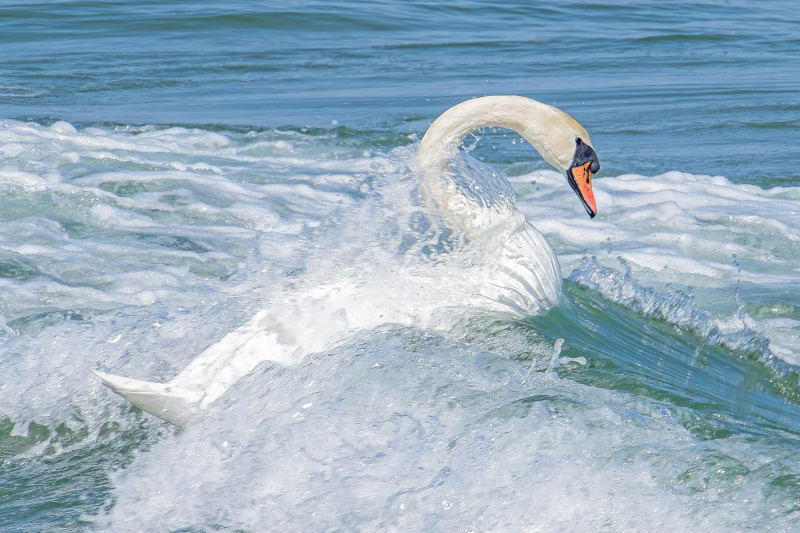
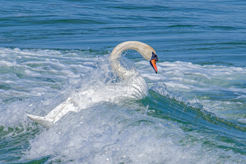
This swan was taking a break from looking after his family, Mrs. Swan and three kids; taking a swim in the waves of the Baltic Sea; Timmendorfer Strand. He obviously enjoyed dancing on the waves a lot.
I cropped the shot, ran it through Topaz Photo AI afterwards. I added some texture and lowered highlights and upped the shadows to underline the shiny touch this white swan dancing on the unsually turquoise sea that your would hardly sea in Germany. The light was amazing that morning.
Shot with Fuji X-T5 and Tamron 18-300 mm f3.5-6.3 - at 1/400s, f9, ISO 250 at 450 mm
Hello, Steph
welcome to our forum and thank you for sharing your image with us. You left a statement behind but no questions. I find your image quite fine. There are several lines leading the eye. Some lines caused by the water are diagonal. The position of the swan is also diagonal and adds a positional contrast. The general texture of the image is good. The eye of the swan is well positioned. Movement can be easily seen through the motion blur. What can be done or what would I do to improve the image? I would increase dehase slightly. That would enhance the colors and the contrast. I would also advise you to look at the bright area on the bosy of the swan. There seems to be a loss in texture. That'll be all I would add. I wish you good light... Cicek
Steph,
Thank you for sharing 'Swan Ballet' with us here in Critique. I think you've visited this section before, and it's nice to see another of your photographs.
I like the high-key effect. The feeling is clean, crisp, pure, and bright. Swans are good subjects for expressing grace and beauty, and to show one like this, as if at play and ready to surf the wave, is interesting.
If it were my photo I'd try for a bit more texture in the highlights and more space on the right. To suggest movement of a subject it's good to leave more space in the direction they're moving - in this case, the right side. To add space there, you can use Photoshop's 'Image>Canvas Size'. Once the new space is created, use the Rectangular Marquee tool to select the right side of the image from the swan's beak to the edge of the image - then stretch it horizontally with 'Edit>Transform>Scale'. The trick with that is to hold the Shift key down as you stretch so that the transformation is restricted to one dimension - in this case, width. If the Shift key is not held down, the selected area will get larger or smaller in both width and height - not what you want here.
To add texture to the highlights I first used 'Filter>Camera Raw Filter>Basic' to lower the highlights with the Highlight slider. Then 'Select>Color Range' selected the brightest areas and, back in Camera Raw Filter, some Texture and Clarity were added with those sliders. If the effect seems too strong, it can be brushed back with the History Brush set to a low Opacity and a low Hardness setting.
Subtle changes, but the image is very nice as it is. As you wrote, the turquoise colour of the water is beautiful. It looks pristine.
Just my opinion of course. Since you're the artist, decisions for composition and editing should be directed by the emotion you want the photograph to convey.
. . . . Steven, senior critic
Hello, Steph
welcome to our forum and thank you for sharing your image with us. You left a statement behind but no questions. I find your image quite fine. There are several lines leading the eye. Some lines caused by the water are diagonal. The position of the swan is also diagonal and adds a positional contrast. The general texture of the image is good. The eye of the swan is well positioned. Movement can be easily seen through the motion blur. What can be done or what would I do to improve the image? I would increase dehase slightly. That would enhance the colors and the contrast. I would also advise you to look at the bright area on the bosy of the swan. There seems to be a loss in texture. That'll be all I would add. I wish you good light... Cicek
Thanks so much, Cicek - very helpful critique that I highly appreciate! I will definitely give it a go with your suggestions!
Steph,
Thank you for sharing 'Swan Ballet' with us here in Critique. I think you've visited this section before, and it's nice to see another of your photographs.
I like the high-key effect. The feeling is clean, crisp, pure, and bright. Swans are good subjects for expressing grace and beauty, and to show one like this, as if at play and ready to surf the wave, is interesting.
If it were my photo I'd try for a bit more texture in the highlights and more space on the right. To suggest movement of a subject it's good to leave more space in the direction they're moving - in this case, the right side. To add space there, you can use Photoshop's 'Image>Canvas Size'. Once the new space is created, use the Rectangular Marquee tool to select the right side of the image from the swan's beak to the edge of the image - then stretch it horizontally with 'Edit>Transform>Scale'. The trick with that is to hold the Shift key down as you stretch so that the transformation is restricted to one dimension - in this case, width. If the Shift key is not held down, the selected area will get larger or smaller in both width and height - not what you want here.
To add texture to the highlights I first used 'Filter>Camera Raw Filter>Basic' to lower the highlights with the Highlight slider. Then 'Select>Color Range' selected the brightest areas and, back in Camera Raw Filter, some Texture and Clarity were added with those sliders. If the effect seems too strong, it can be brushed back with the History Brush set to a low Opacity and a low Hardness setting.
Subtle changes, but the image is very nice as it is. As you wrote, the turquoise colour of the water is beautiful. It looks pristine.
Just my opinion of course. Since you're the artist, decisions for composition and editing should be directed by the emotion you want the photograph to convey.
. . . . Steven, senior critic
Thanks so very much for the time taken to give me such fabulous critique combined with lots of learning, too! I am excited to go back and work with your suggestions ❤️

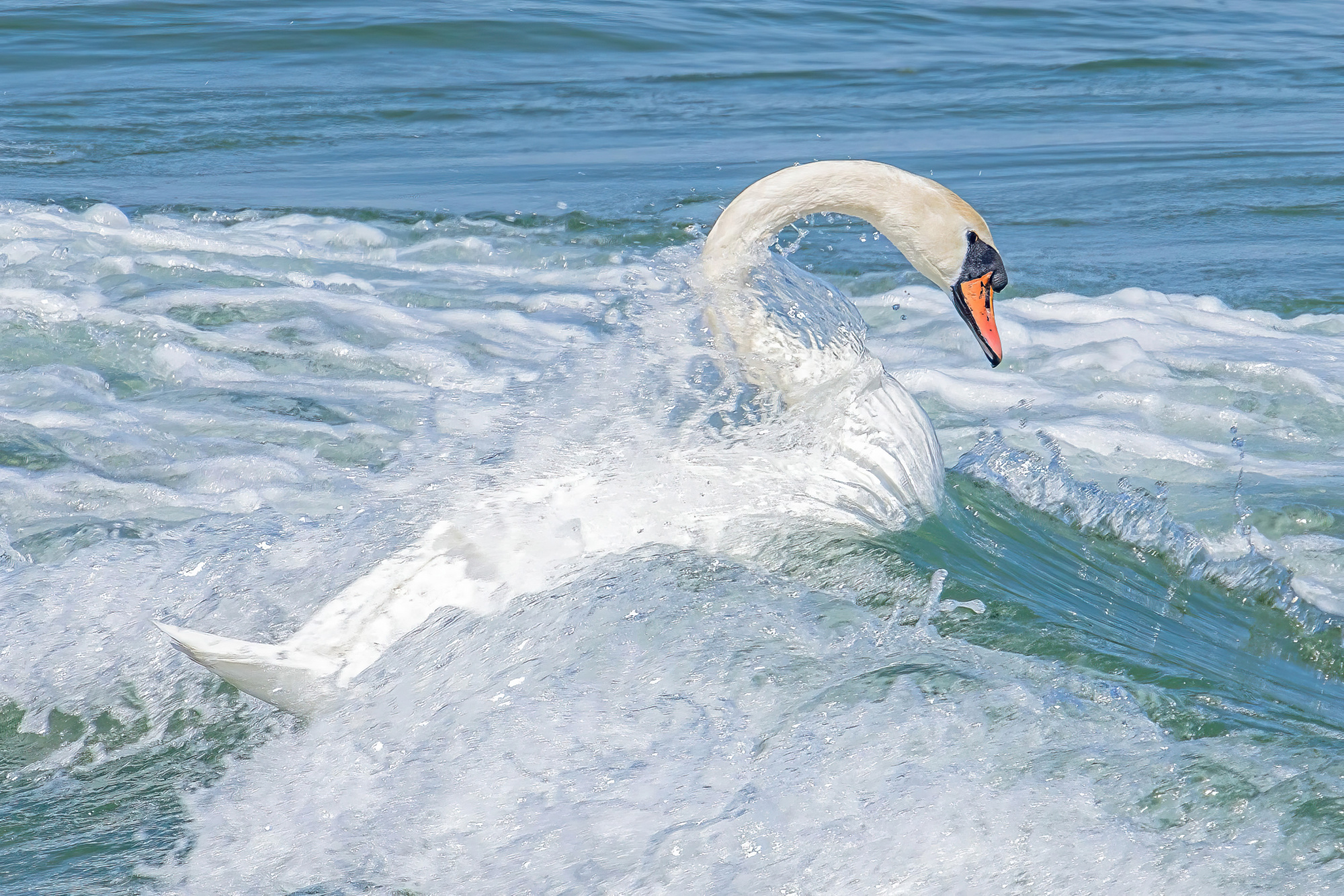
@Steven, @Cicek - I've taken aboard your feedback. As I cropped the photo, I had some room in the original photo on the right to underline the movement of swan as suggested. I've added also added some texture and reduced highlights and whites for better balance. I really like the result and I hope you, too?! Thanks again for your suggestions and time.
Steph,
The new version looks good! Thanks for posting.
Steven
