|
|
|
|
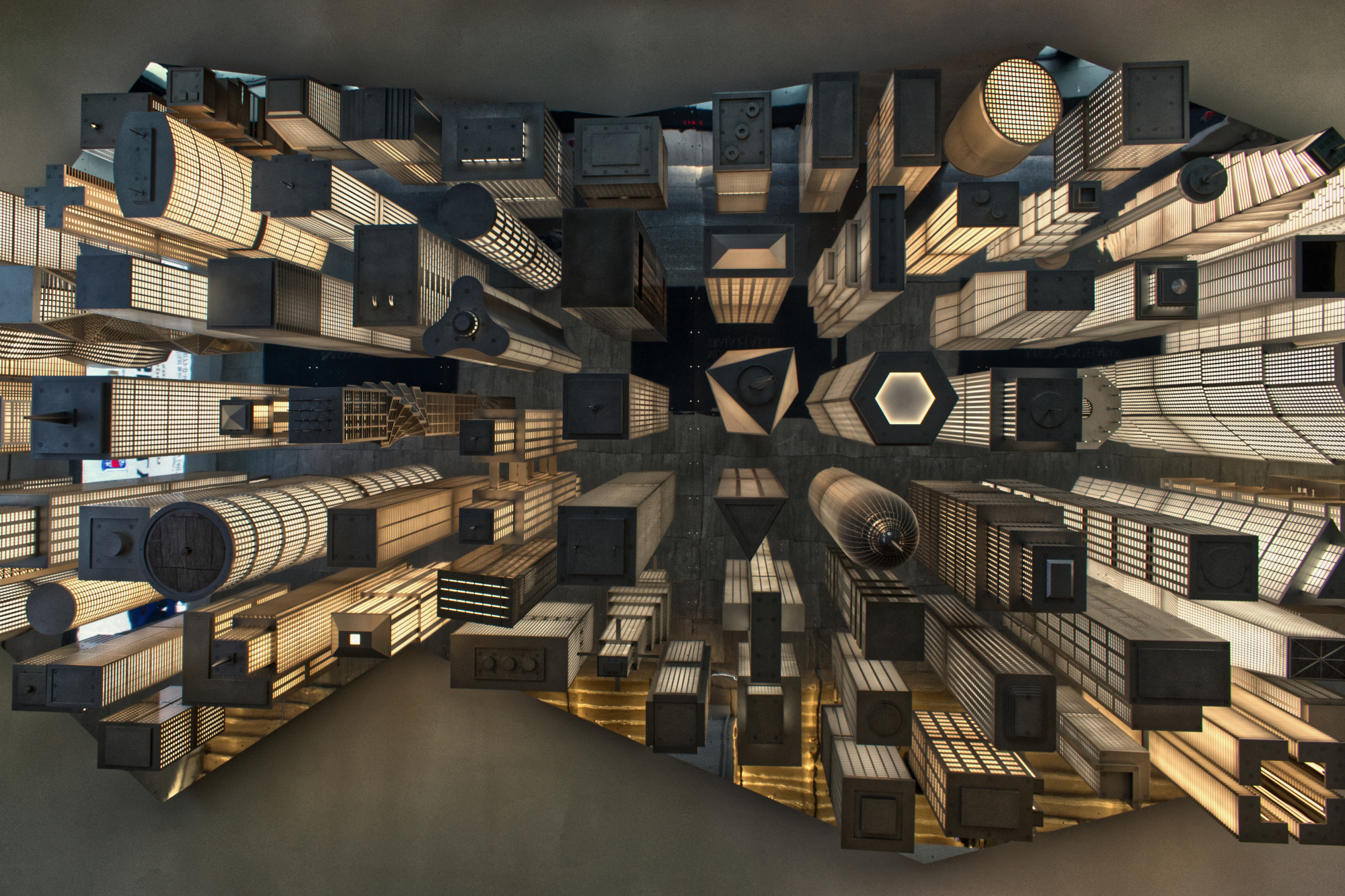
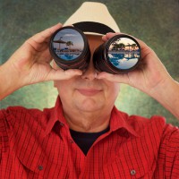
Hi all,
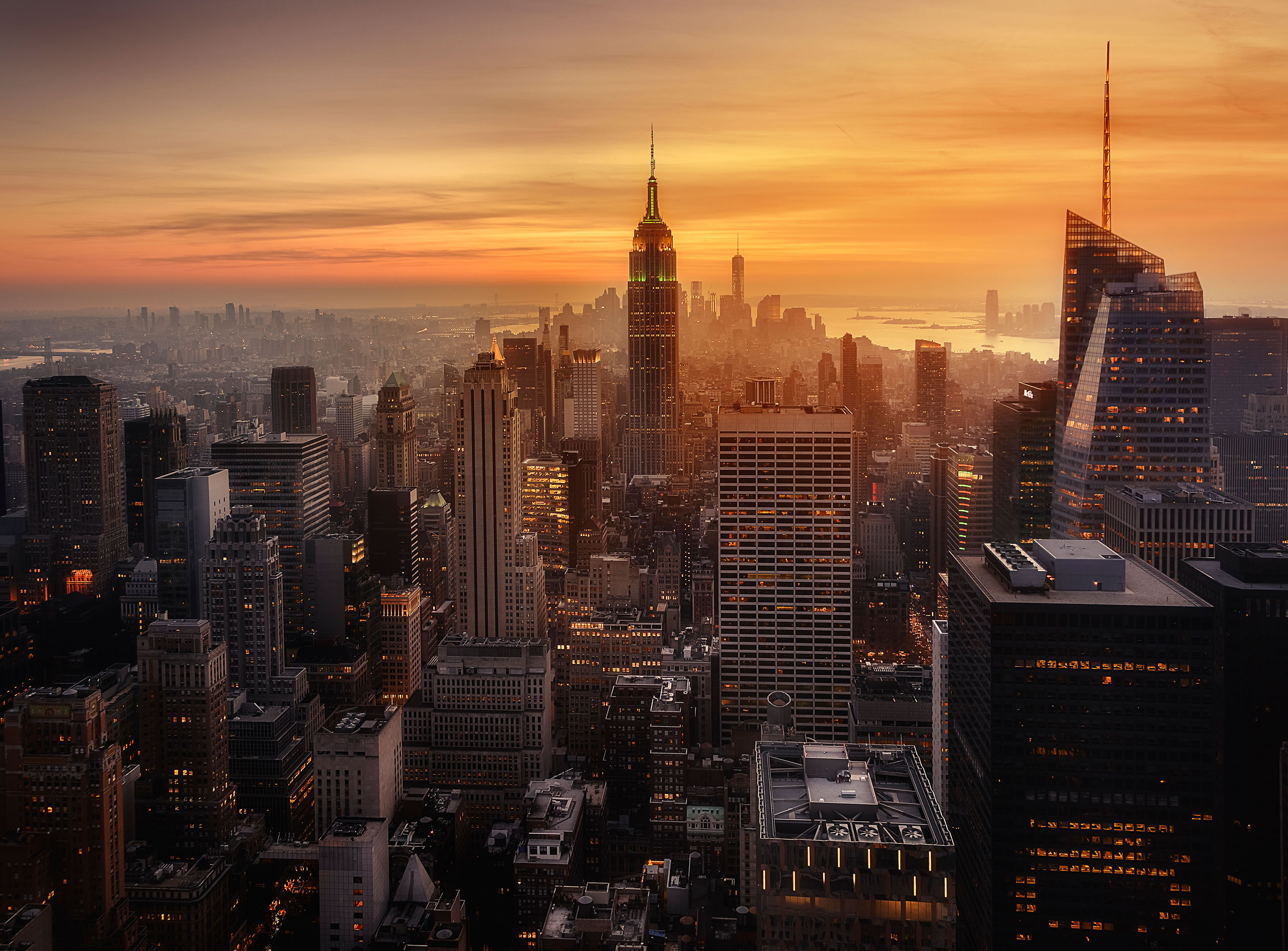
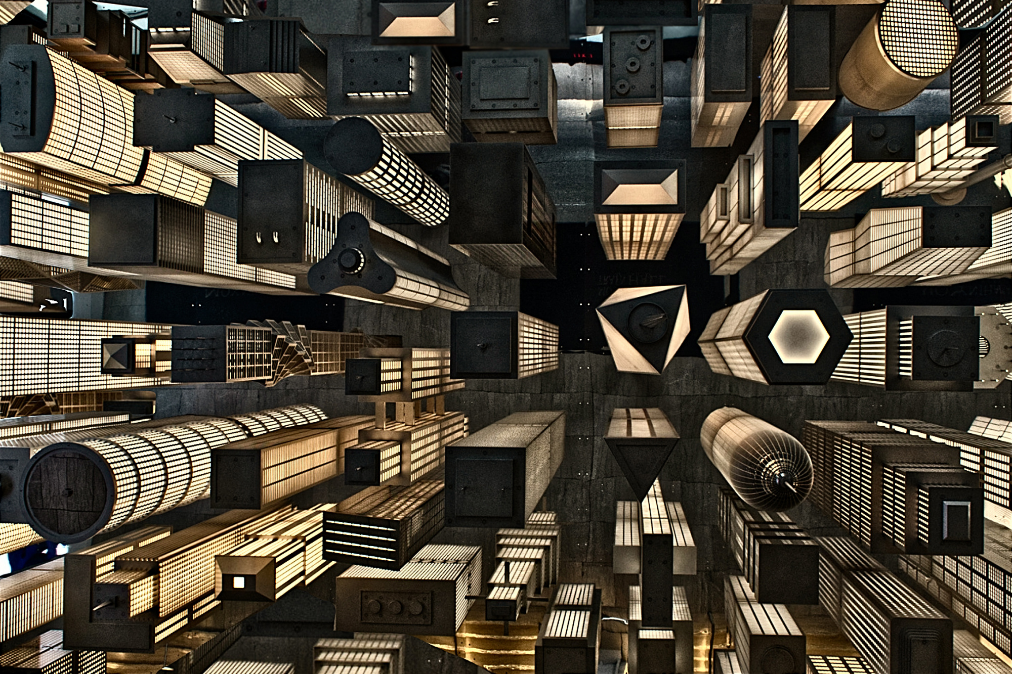
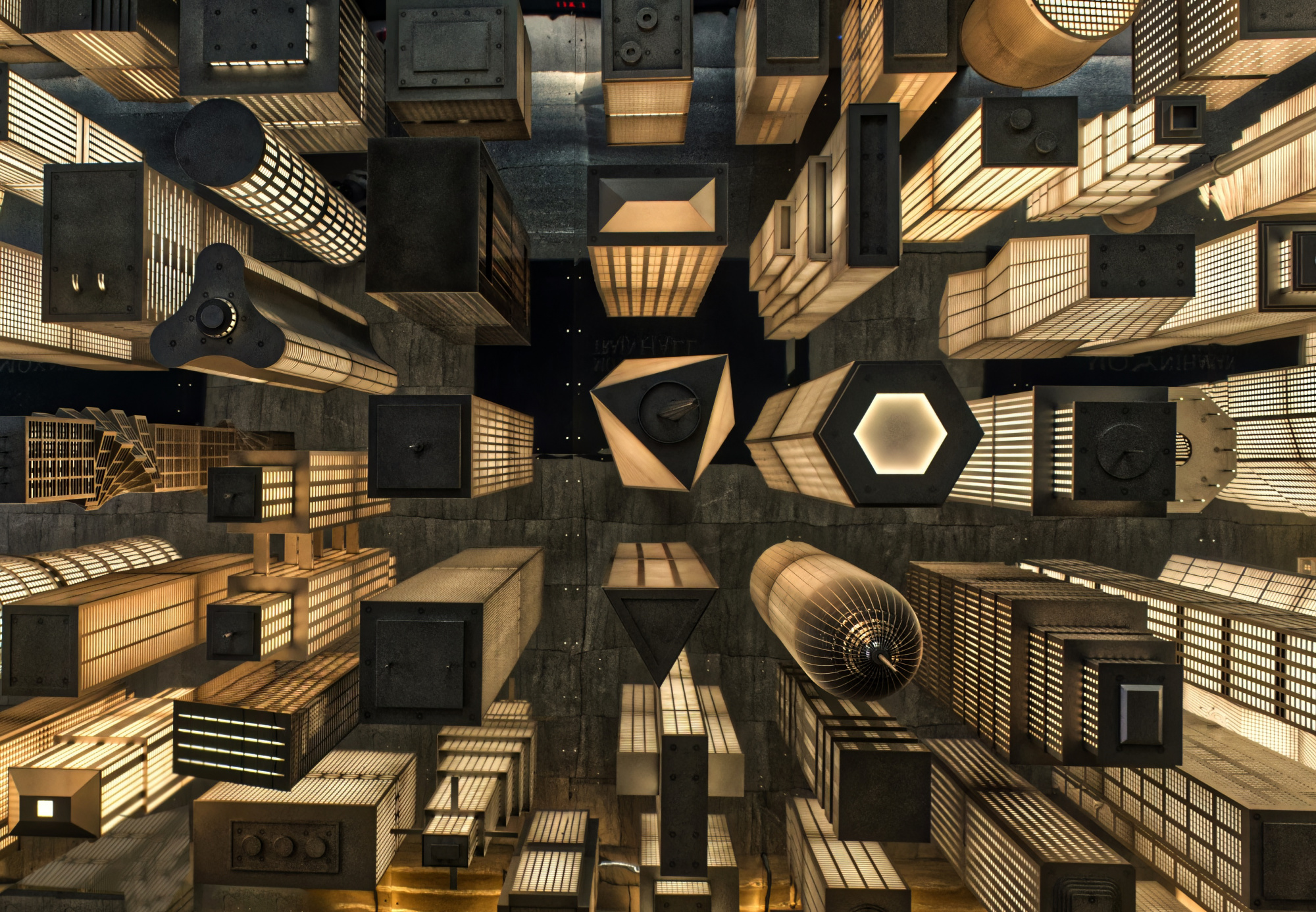
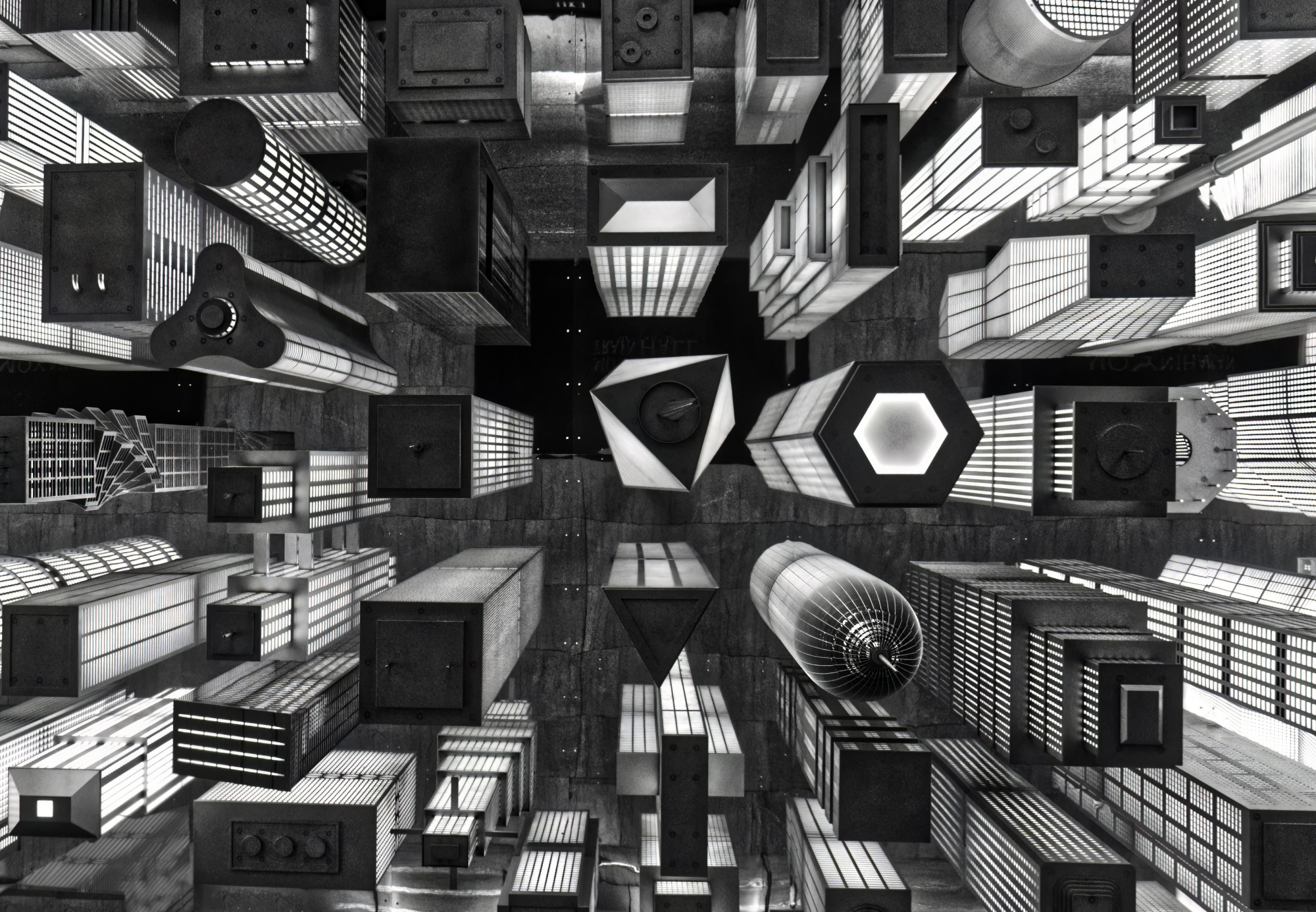
I took this photo yesterday at the Moynahan Train station in New York City. This construction is hanging from the ceiling (about 50 Feet up) at one of the entrances. It is public art, installed as a part of the renovated train stations enhancements.
I thought it was pretty cool and liked the color and 3D element of the sculpture. It definitely makes me think NYC.
Any thoughts or areas for improvement would be gratly appreciated.
ISO 400, 1/2.5, F5.6, 18MM. Photoshop and Affinity software
Best regards, Patrick
Patrick,
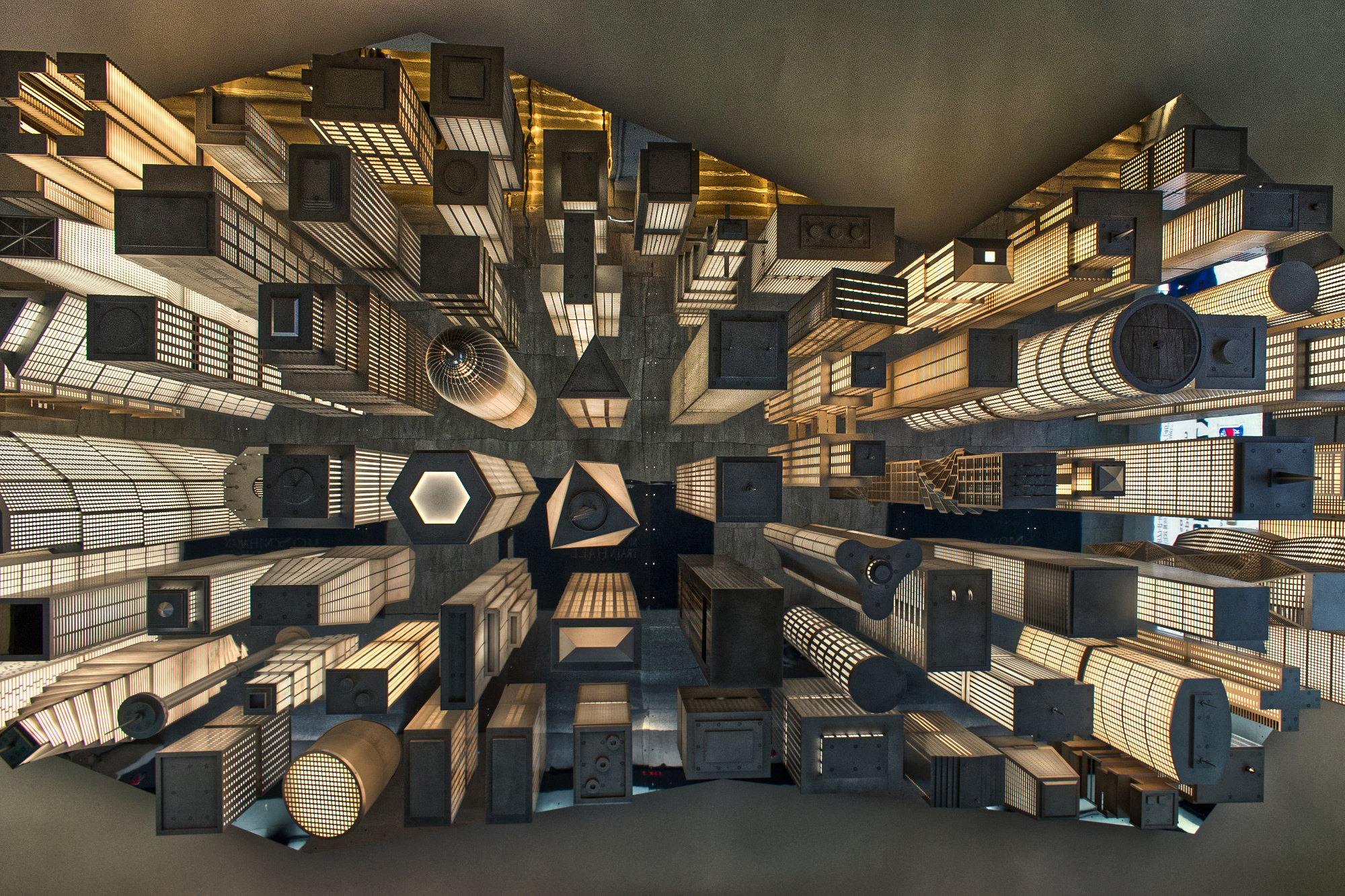
A quick impulsive comment, perhaps I will come later but I think no need. My first reaction was nice like it is and than I had two ideas. First I should turn 180 degrees be;low more flat and triangles above and second a little bit more power. I brought him in Camera raw and used the radial and lineair gradient. And with the sleeves light,shadow and contrast. Below my first idea,. Theo-senior critic.
PS. and perhaps you can find some places to give special attention.
Patrick,
A quick impulsive comment, perhaps I will come later but I think no need. My first reaction was nice like it is and than I had two ideas. First I should turn 180 degrees be;low more flat and triangles above and second a little bit more power. I brought him in Camera raw and used the radial and lineair gradient. And with the sleeves light,shadow and contrast. Below my first idea,. Theo-senior critic.
PS. and perhaps you can find some places to give special attention.
Thanks Theo. I like the the 180. For lack of a better word from me, it gives the image more stability, if that is possible.
Thanks again,
{atrick
Patrick,
You are right. Below more flat and also a fraction darker. Make him ready for a successful curation. For me a great chance. TheoSC
Hi Patrick,
here is a very, very quick and dirty try:
i used a part of your fine photo and filled the gaps with some parts of the original photo. Then i increased the vivid of the new picture.
Regards
Ud:o)
Dear Patrick,
Good to see you back at the Critique fourm.
I like your image, it creates an interest to find out more about it. I personally would crop it much tighter to creat a bigger impact.
I cropped itm and produced a color version and a blck and white version. I also took it to to Photo Shop and tried few options in filter gallery.
I also used Topaz AI programme to reduce noise.
Herewith the samples. Hope you like it.
It is of course, only my opinion.
Good luck
Warm regards
Arnon Orbach S.C.
Hi Patrick,
here is a very, very quick and dirty try:
i used a part of your fine photo and filled the gaps with some parts of the original photo. Then i increased the vivid of the new picture.
Regards
Ud:o)
Hi Patrick,
here is a very, very quick and dirty try:
i used a part of your fine photo and filled the gaps with some parts of the original photo. Then i increased the vivid of the new picture.
Regards
Ud:o)
Nice work Udo, I like what you did. Interesting concept for removing the empty areas. I also have a little problem with the perimeter. I will definitely take this inder consideration.
Thank you, Patrick
Dear Patrick,
Good to see you back at the Critique fourm.
I like your image, it creates an interest to find out more about it. I personally would crop it much tighter to creat a bigger impact.
I cropped itm and produced a color version and a blck and white version. I also took it to to Photo Shop and tried few options in filter gallery.
I also used Topaz AI programme to reduce noise.
Herewith the samples. Hope you like it.
It is of course, only my opinion.
Good luck
Warm regards
Arnon Orbach S.C.
Thank you Arnon. Kind of moving in the same vain as Udo, but with a different approach. I like yours also, and need to make a decision. For me, eliminating the grayish border would be a significant change to the image. I will definitely spend some time studying this approach.
Best regards, Patrick
Patrick,
A quick impulsive comment, perhaps I will come later but I think no need. My first reaction was nice like it is and than I had two ideas. First I should turn 180 degrees be;low more flat and triangles above and second a little bit more power. I brought him in Camera raw and used the radial and lineair gradient. And with the sleeves light,shadow and contrast. Below my first idea,. Theo-senior critic.

PS. and perhaps you can find some places to give special attention.
Thanks Theo. I like the the 180. For lack of a better word from me, it gives the image more stability, if that is possible.
Thanks again,
{atrick
Patrick,
You are right. Below more flat and also a fraction darker. Make him ready for a successful curation. For me a great chance. TheoSC
Thank you Theo,
Patrick
Hello, Patrick
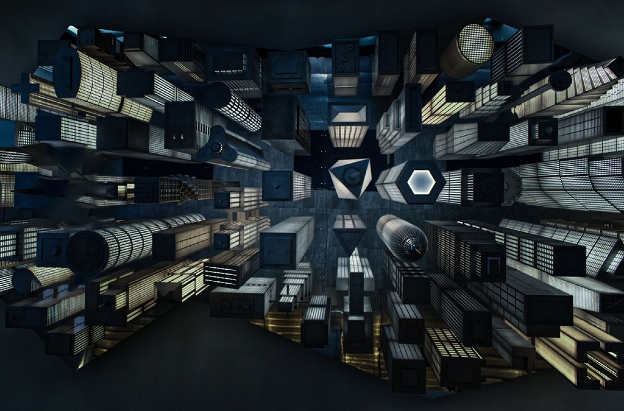
Welcome to the forum. This is a really nice image that gives one a feeling of excitement. I had someting in mind about it, so I had a look at it in Photoshop. I made a radial gradient and reversed it. Then I darkened the edges. That dragged me more inside the image. Then I changed the white balance towards blue. I also added some green to it. That added a feeling of depth to it. I also saw some distractions on the left side and I used the patch tool to get rid of them.This is another option for you to consider. I wish you good light. Cicek Kiral...
Hello, Patrick
Welcome to the forum. This is a really nice image that gives one a feeling of excitement. I had someting in mind about it, so I had a look at it in Photoshop. I made a radial gradient and reversed it. Then I darkened the edges. That dragged me more inside the image. Then I changed the white balance towards blue. I also added some green to it. That added a feeling of depth to it. I also saw some distractions on the left side and I used the patch tool to get rid of them.This is another option for you to consider. I wish you good light. Cicek Kiral...
Really cool Cicek. I like what you have accomplished with the image. For my eyes, you have converted it from a day image to a night image, which really works out nicely.
Thanks for your suggestioins! Patrick
Just to let you guys know, the image was published, so I want to thank you alll again, for your help!
Best rergards,
Patrick
